Mercular cover photo

Timeline

3 months (June - August 2022)

Location

Bangkok, Thailand

Tools

Figma, Miro

About Mercular

Mercular is a Thai e-commerce site specialized in selling electronic gadgets such as headphones, speakers, laptops, etc.

My Contribution

Because this is a solo project, I was responsible for all of the design process, which includes ideation, research, prototyping, and user-testing.

Problem Statement

Mercular users don’t have an effective way of saving an item for later viewing on the website. Although adding an item to cart is an alternative, it is not possible if the product is out of stock or currently unavailable. This has negatively affected the customer retention rate of the website.

Competitive Analysis

I conducted a competitive analysis of several competing e-commerce platforms and documented the functionalities that could be beneficial for Mercular users:‍

  • Integrating the Wishlist/Favorites icon on the navigation bar allows for users to easily access the Wishlist page.
  • An option for users to “subscribe” to a product and be notified if a product is running low on stock.
  • Having a sidebar on the left helps users conveniently navigate to the other pages from the Wishlist page.

Brainstorming

To help align myself with the user needs based on the research insights, I came up with a “How Might I” (HMI) question:


How might I implement a feature that allows users to save a product they like for later in a way that is meaningful and engaging?

Solution

My solution was the Wishlist/Favorites concept, which contains the following features that addresses the HMI question:‍

  • Allows users to save products they like, regardless of whether they are out of stock or unavailable to the wishlist. (Meaningful)
  • Allows users to subscribe to a product, which will notify users when the products are restocked, low on stock, or on discount. (Meaningful)
  • Allows users to view other relevant/similar products in the wishlist and share their wishlist to friends and families. (Engaging)

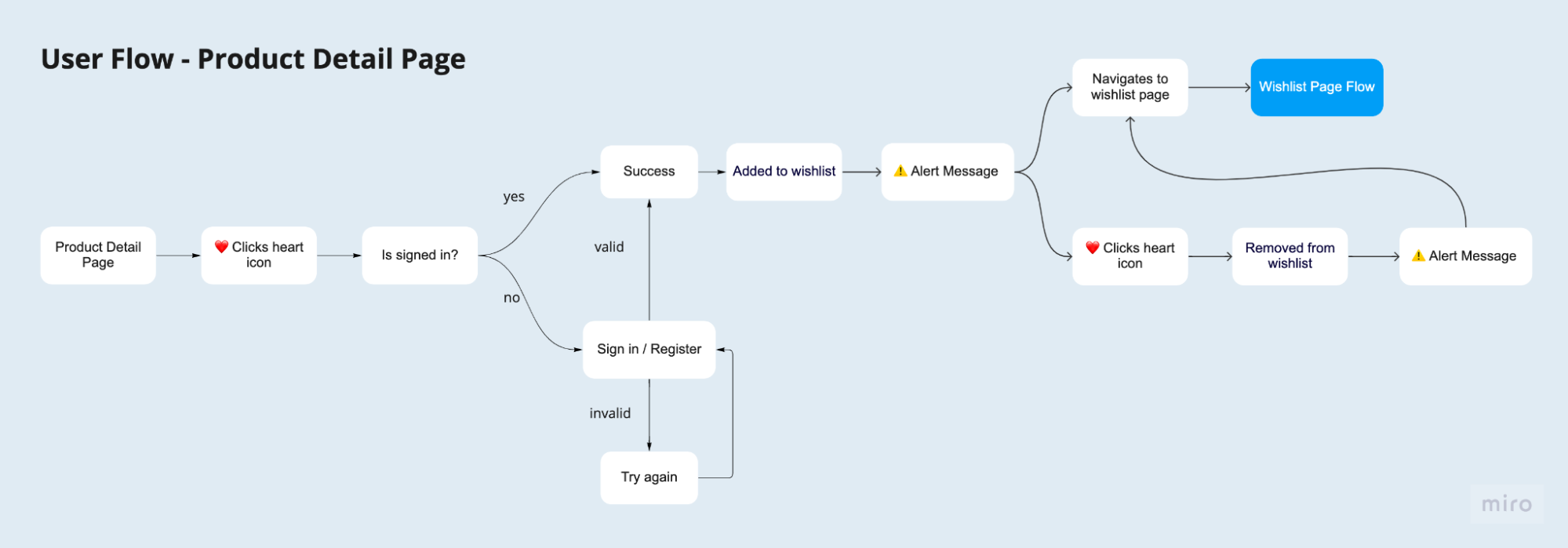
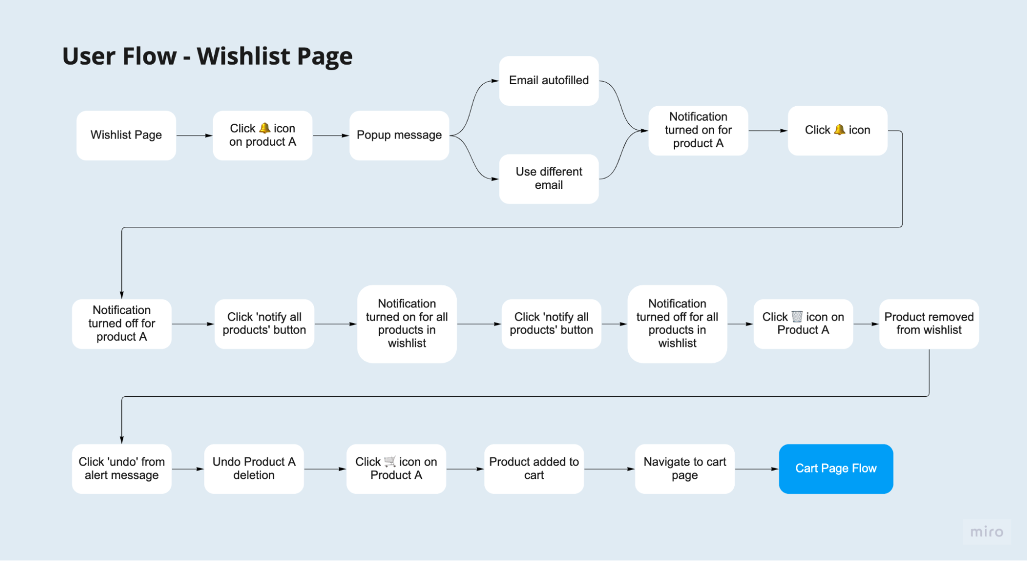
User Flow


wishlist user journey 1


wishlist user journey 1


Paper Prototype


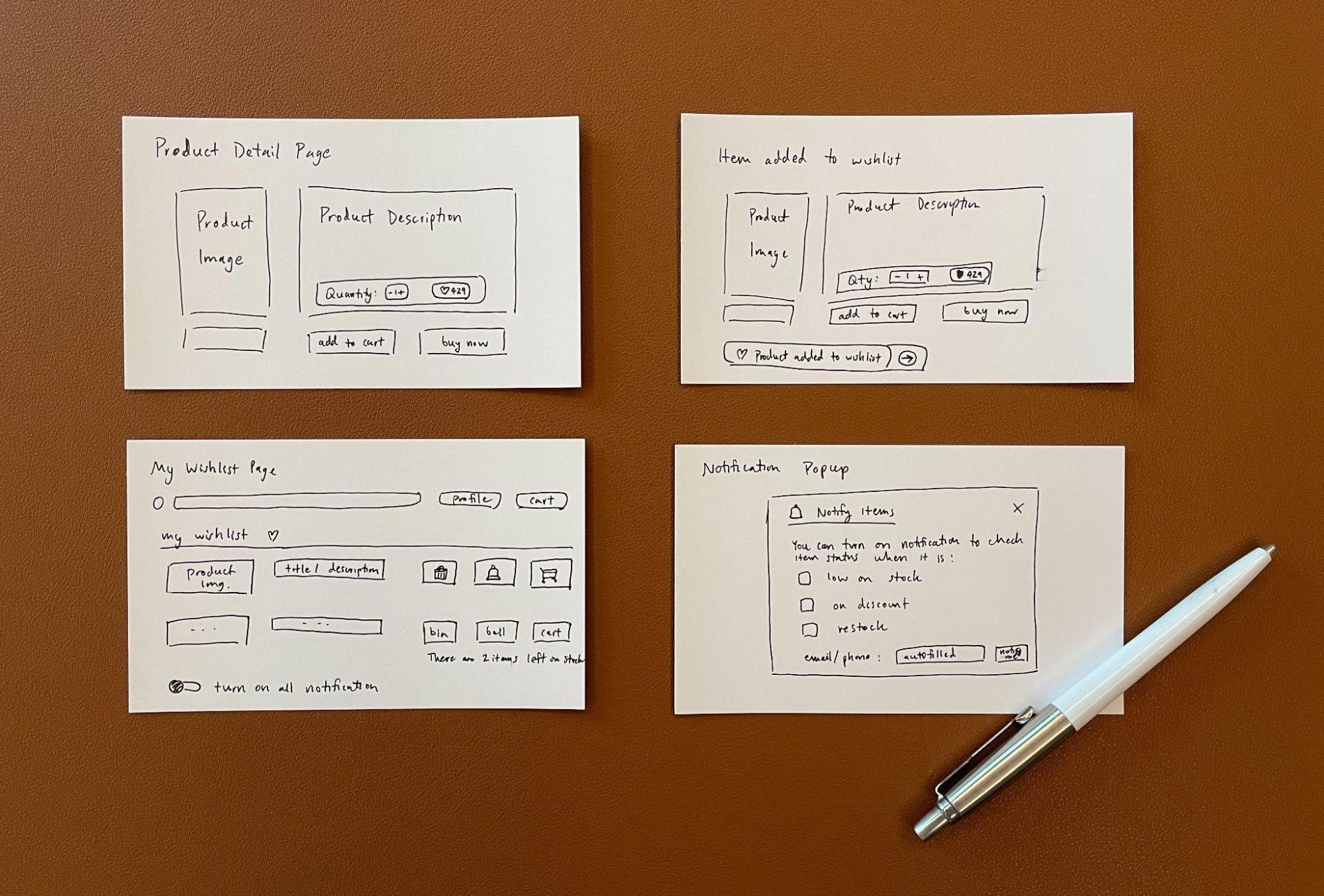
Paper prototype of the wishlist


Mid-fi Prototype

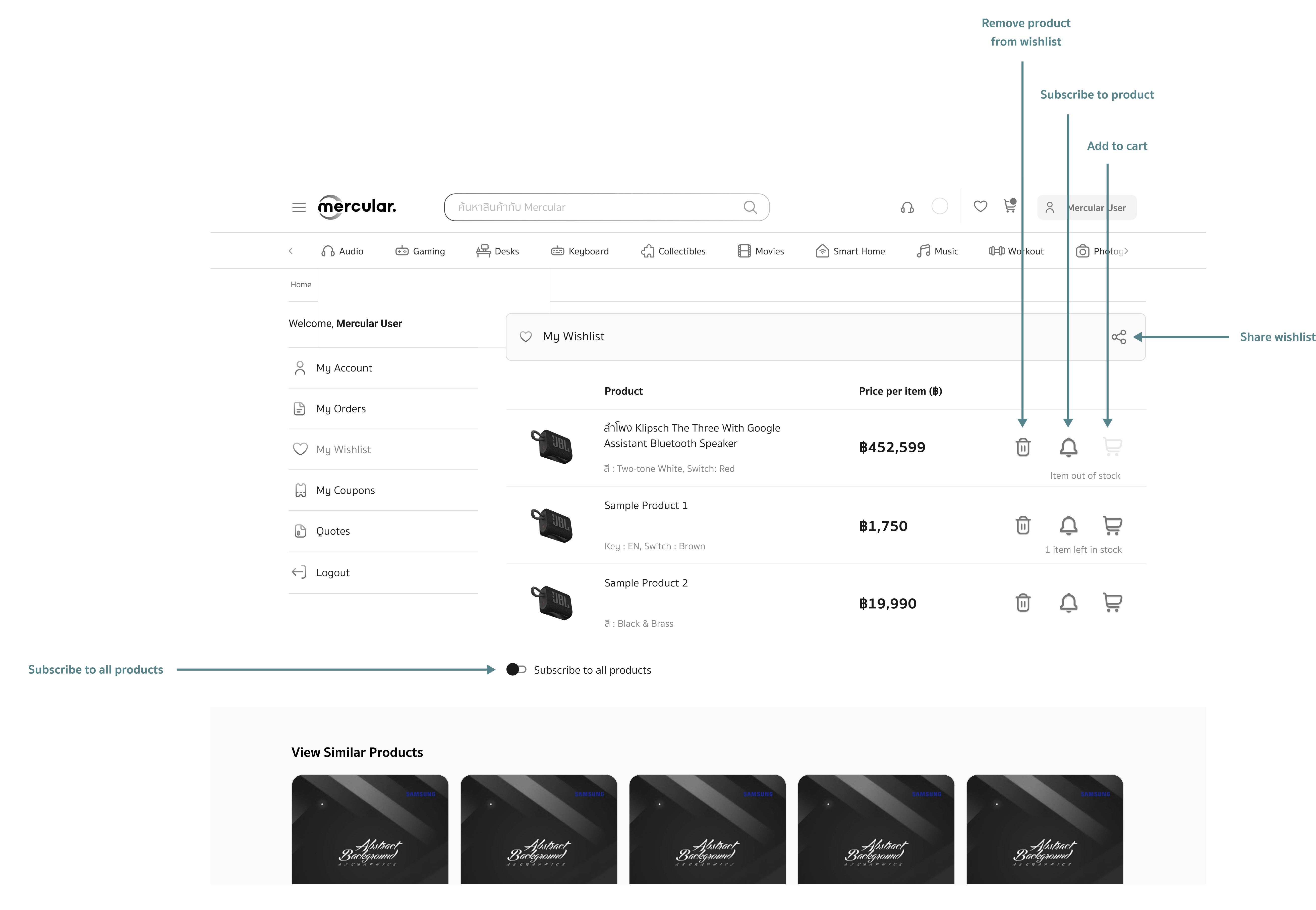
wishlist midfi prototype

Usability Testing


As part of the interactive design process, I asked the same 7 interviewees to go through usability testing in order to gain some feedback.


After completing the usability testing, I had follow-up questions about user behavior and insight issues of this project.


I asked the interviewees to complete the System Usability Scale (SUS) to get a rough performance on my design usability, which received a score of 79.37.

Affinity Mapping


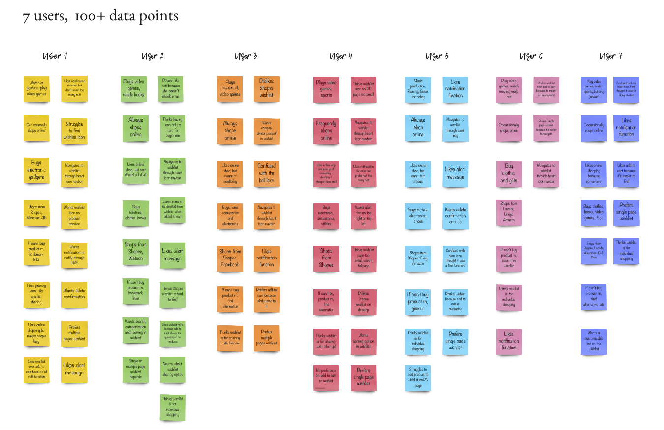
To organize all the data points collected from the usability testing, I began by mapping out the data in Miro.


affinity mapping 1

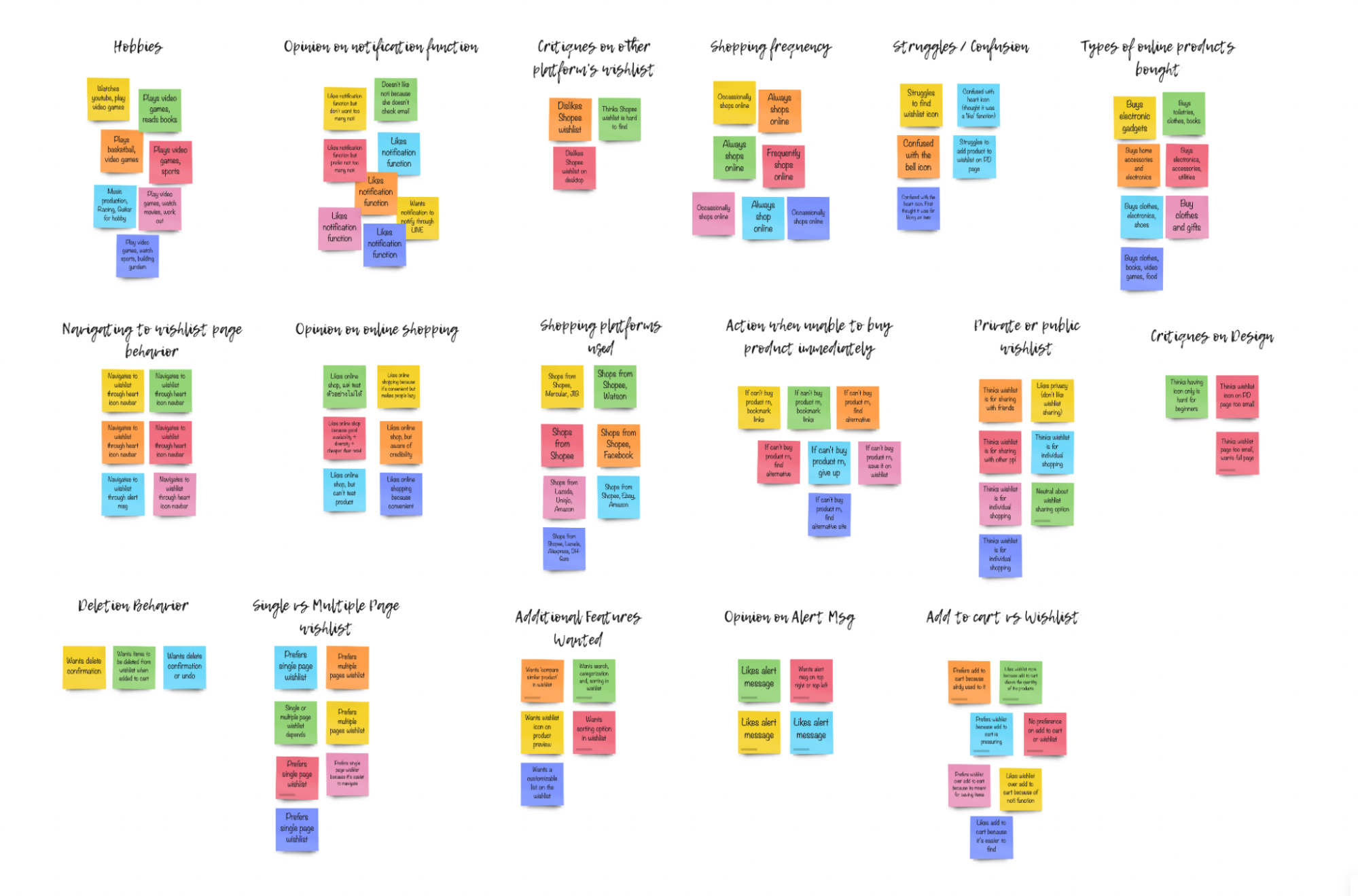
Afterward, I grouped those data points into similar categories and used this organized data to identify three pain points from my Mid-Fi Prototype.


affinity mapping 2

Finally, I made the following design revisions to address those pain points.

arrow down

Design Revisions


Design Revision 1: Product subscription

subscribe feature


Design Revision 2: Product deletion

undo feature


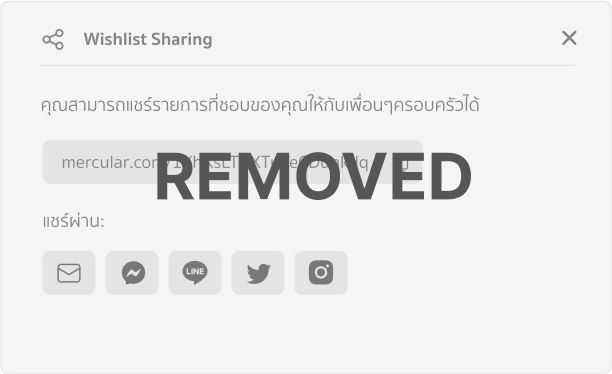
Design Revision 3: Wishlist Sharing

wishlist sharing feature removed

Usability Testing

After a discussion with the engineering team on the feasibility of my ideas, I developed a higher-fidelity design for my ideas and conducted usability testing with 12 participants.


I wrote a detailed testing script with clear goals and objectives that I hope to get from the users. During the testing session, I assigned participants specific tasks to complete and observed them through screen sharing. I asked them follow-up questions and gathered any suggestions they might have.


I then mapped out all of the insights and made multiple iterations on my design. From talking with the participants, I received lots of important insights that helped answer many of the concerns and questions I initially had.
Final Wireframe


Adding product to Wishlist:


Adding to wishlist


Navigating to Wishlist:


Navigating to wishlist


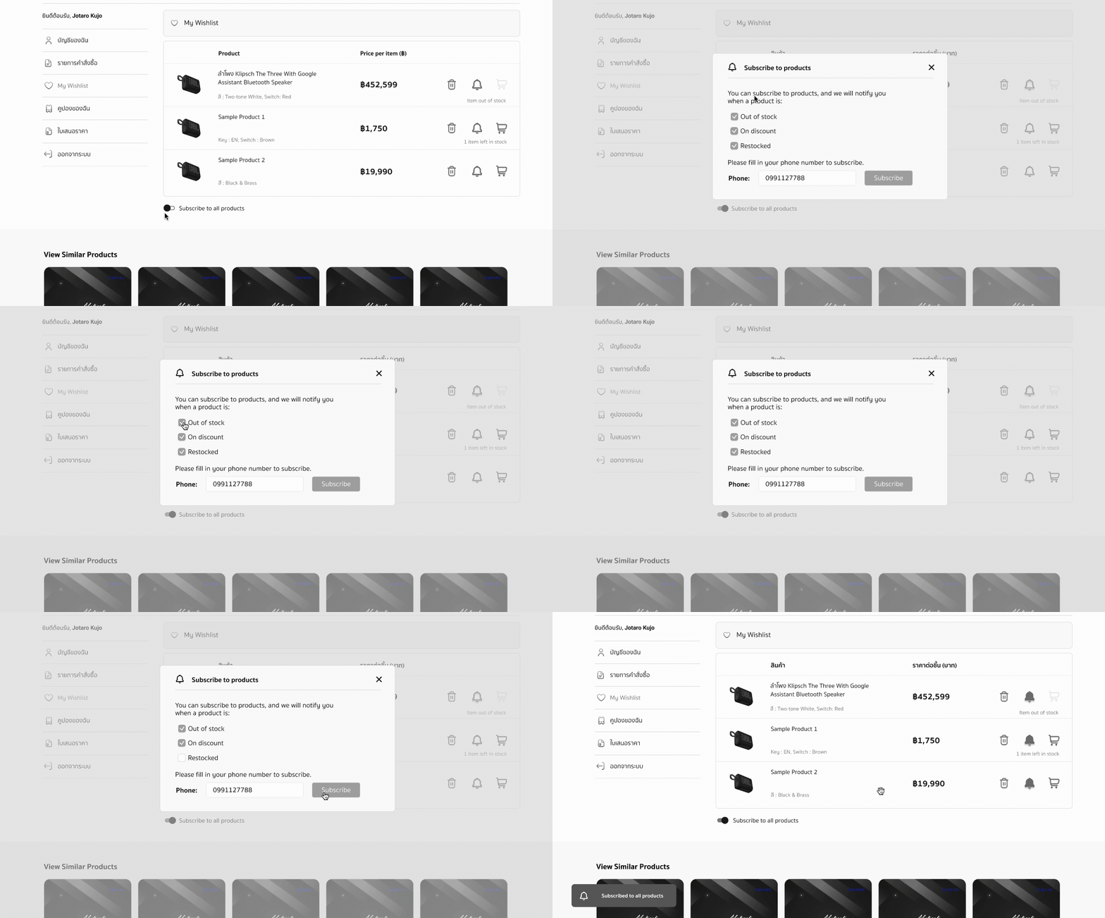
Subscribing to all products in Wishlist:


Subscribing to all products


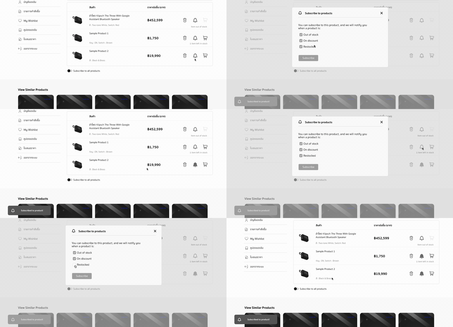
Subscribing to a single product in Wishlist:


Subscribing to a single product


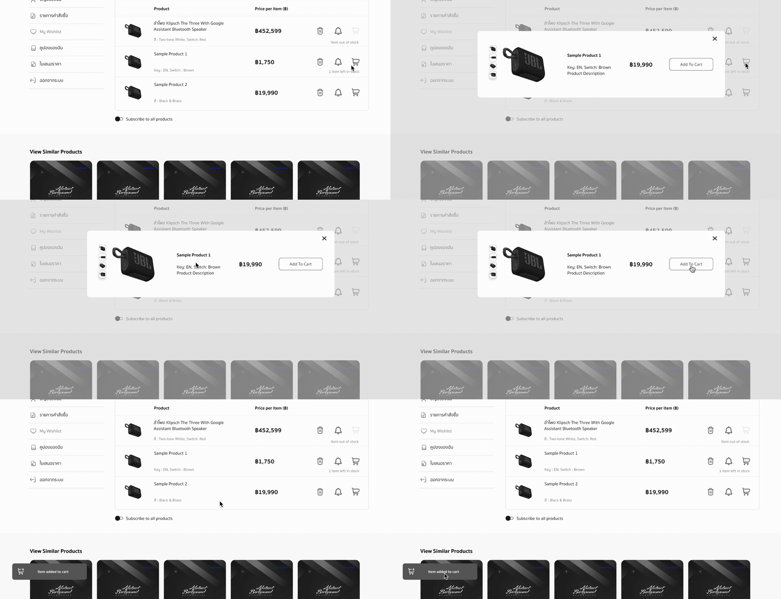
Adding product to cart:


Adding product to cart


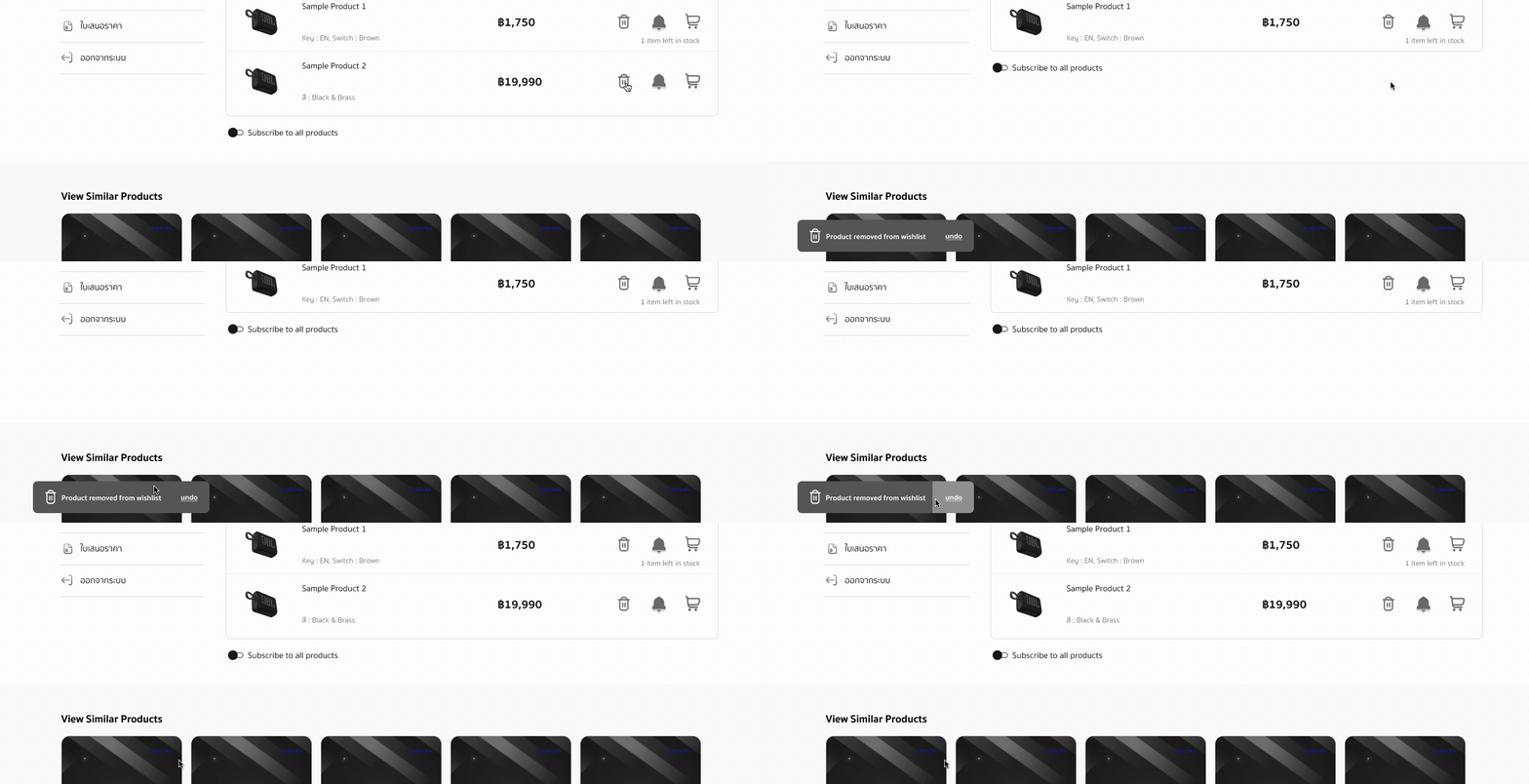
Removing products from Wishlist:


Removing product from wishlist


Outcome


The wishlist feature was launched in Q1 2023 and the website saw a 4% increase in customer retention rate.

Reflection


This was my first ever UX project and my first exposure to the UX industry. Apart from learning and experiencing UX workflow and principles, there were many takeaways I got from this internship:


1. Design is not art:‍


The difference between design and art is that that design always has a purpose. UX Design is not only about making pretty products. It’s about following a user-centered design process to deliver a product that not only satisfies the user’s needs but also provides them with a meaningful experience.


2. Never make any assumptions, you are NOT the user:


‍It was sometimes tempting to base design choices on what I assumed was good for the user. However, designers can never accurately represent the target user because they have spent much more time and depth studying the product. Instead, we should always design iteratively and exploratively by frequently involving users, getting critiques, and making analysis and refinements.


3. Exercise UX principles with caution:


‍Although it is crucial to be aware of different design principles and heuristics, we cannot blindly apply them without context. We need to first understand the end goal of our design, learn about our users and their behaviors, and understand the trade-offs between different design principles.